Wednesday, April 13, 2011
Grassy Tiles...bringing the outside INDOORS !
We have a funky little utility room that leads to the outside shower area and its in need of a cool hip upgrade.
Wanna have a little fun with this space.....
Wednesday, April 6, 2011
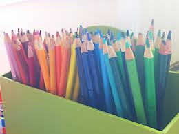
Organizing by color
I love the feeling of a well organzied space, but I also have to do what works for my brain. My brain thinks in color, I wont remember the name of the book, but I will remember the color. Lots of designers are like this. I think this kind of color cordinating makes life ....easier.
Thursday, February 3, 2011
Holly Procktor is the Answer !
So, its almost impossible to get my best friend Kris to keep anything alive. How can a plant junky like myself have a best friend that cant keep a rock alive? So when I saw Hollys work in one of my favorite on line magazines Covet Garden, I had to show all my peeps....
Thursday, January 13, 2011
I am the Queen of the World !
 These lovely Rugs come in 5 colors and can be hung or used as a rug. If you are interesed in the prices of these gorgeous works of art, please contact us or the maker himself .
richard@rug-maker.com
Friday, January 7, 2011
Thursday, January 6, 2011
A Bird in the Hand is worth two in the house !
Bird,bird, bird, bird is the word....
DWR (Design Within Reach) sells these super sleek and ultra mod little feeders. Its a great way to continue pops of color around your yard and bring the birds....
DWR (Design Within Reach) sells these super sleek and ultra mod little feeders. Its a great way to continue pops of color around your yard and bring the birds....
Prickly Pear Chair.....
When I saw this chair I stopped in my tracks, first a pink chair, second a pink chair with cushions that are in the shape of prickly pear, cushions that are soft, prickly pear which is sticky, I couldnt help but love the contrast and the visual play on opposing the typical senses. Because you cant normally sit on a cactus. So, I needed to share this lovely little oxymoron.
Tuesday, January 4, 2011
Wednesday, December 29, 2010
Great Investment for Landscape Designers and Landscape Architects
This is one of my Favs' it just keeps me informed,inspired and intrigued. Gotta have this to work !
Tuesday, December 21, 2010
Adam Wallacavage Rocks My World
http://www.jonathanlevinegallery.com/
Adam Wallacavage
“Pop Surrealism”
Museo Carandente Palazzo Collicola
Piazza Collicola – Spoleto (PG) ITALY
June 26th 2010 – October 15th 2010
Vintage Designed Flower Seed Packs from the 1800's and great penmenship
I have always loved Typography and if I was better at Graphic Design in college I would of probably changed careers purely on the fact that I love a good font. When I say love, I truly mean love, I search for a great font, it sings to me it makes me want to open someones website or flip a page. A great font can propel the average browser to stop,look and READ !
When I was in college in design school, and we were learning the proper way to architectural write our alphabet and letters, I would harbor deep lust and jealousy for my dear friend Danielle who naturally had a penmanship that was so accurate and gorgeously close to what I had to work very hard to get for architectural drafting class.
I longed for her penmanship and that was the moment I knew i had a love for typography. I began to seek styles out and later after college, when I had my own business i would try out different styles on my title blocks, having a little fun with some the old antique style lettering like Frederick Law Olmsted's used on the Landscape plans for Central Park.
I have been getting feedback the my Garden blog, should be only that , something just for garden designers, gardeners, plant people and I should only focus on what pertains to that. Well, I am not that and cant be that and never will be just that. A lover of design and nature is a lover of all things that inspire. When you want something to look beautiful, you pull from everything to get to that point. This is little blurb this week is about being inspired by Typography and paying homage to fonts that make us melt, help us turn the page, make us click on a website, and for me help me want to improve my penmanship.
Subscribe to:
Comments (Atom)


